
Colour is one of the most discussed and most mishandled parts of a kitchen project. It’s tempting to chase whatever feels exciting right now, but a kitchen is a long-term investment, and the shade you choose will be living with you for years. Getting it right means thinking beyond the paint chart.
Why colour in a kitchen is different from the rest of your home
In a living room or bedroom, colour sits on the walls and you can repaint if you change your mind. In a kitchen, colour is applied to cabinetry, which is a fixed commitment. That changes the stakes considerably.
It also means you’re working with a much larger surface area. A colour that feels subtle on a small sample can read as overwhelming once it’s covering thirty or forty cabinet doors. The scale of the application matters as much as the shade itself.
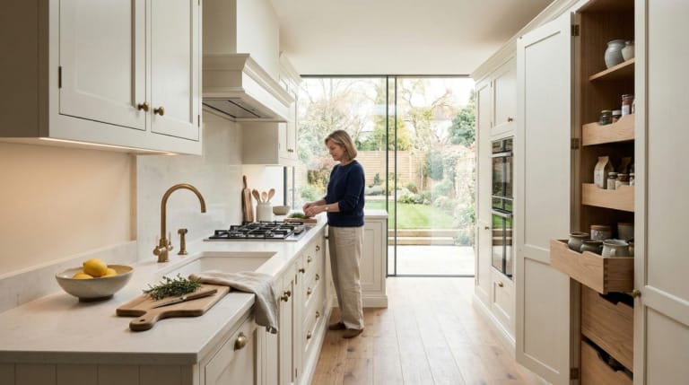
There’s also the question of how kitchens are used. They’re working rooms. They’re lit at different times of day, by different light sources. The colour you see on a Sunday morning in natural daylight will look quite different on a Tuesday evening under artificial lighting.
How light affects the colours you choose
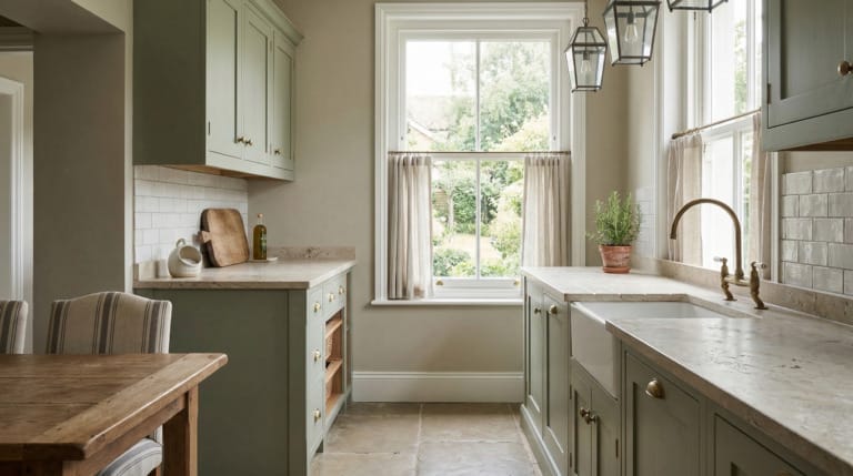
North-facing kitchens receive cooler, more diffuse light. Blues and greens can take on a grey, slightly flat quality in these rooms. Warmer tones, such as soft ochres, dusty terracottas, or warm off-whites, tend to hold better because they borrow warmth from even limited light.
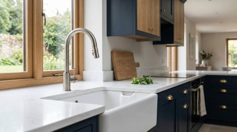
South-facing kitchens have the opposite luxury. They can usually carry cooler shades well because the light is doing the warming work. A slate blue or a deep olive can feel grounded and rich rather than cold.
Before you commit to any colour, spend time observing how light moves through your kitchen at different points in the day. If you’re working with a designer, bring photographs taken at various times. Light changes more than people expect, and it should inform your decision.
Balancing bold choices without overwhelming the space
If you want to use a strong colour, which is entirely reasonable, the key is usually in how it’s balanced rather than whether you use it at all. A deep forest green or a rich navy can work beautifully in a kitchen. It’s the application that determines whether it sings or suffocates.
One approach is to use the stronger colour on lower cabinets and a lighter tone or plain white on the uppers. This keeps the visual weight low, which feels more settled and gives the room breathing space. It also lets you introduce personality without the risk of the colour dominating every angle of the room.
Worktop material plays a part too. A heavily veined marble or a warm sandstone can act as a visual bridge between a bold cabinet colour and the rest of the room. The goal is to make the colour feel considered rather than applied.

Whether to follow colour trends or ignore them
New colour announcements from paint brands and appliance manufacturers come around every year, and they’re worth paying attention to, not because you should follow them, but because they reflect a broader shift in what people are drawn to. That’s useful information.
Where people go wrong is treating a trend as a prescription. If a particular shade is being widely promoted and it happens to suit your kitchen’s light, your materials, and your taste, then use it. If it doesn’t, leave it. The best kitchens aren’t the ones that followed the mood board of a given year.
Colours that tend to age well share certain qualities: they have enough complexity to be interesting without being loud, they work with natural materials, and they don’t rely on a specific moment in time to make sense. Flat, highly saturated shades often date faster than more nuanced tones.
Choosing colours for different parts of the kitchen
It’s worth thinking about colour in zones rather than as a single decision. Your cabinetry, your walls, your worktop, your flooring, and any architectural elements like alcoves or shelving all contribute to the overall palette.
A common mistake is selecting the cabinet colour first and then trying to make everything else fit around it. It’s usually more productive to start with the fixed elements you can’t easily change, such as flooring or an existing stone, and build the palette from there.
If you’re considering open shelving, remember that whatever sits on those shelves becomes part of the colour composition too. A set of terracotta ceramics or a run of dark-spined cookbooks will read differently against a pale grey wall than against a deep green one.

How Mastercraft approaches this
At Mastercraft, colour is always discussed in the context of the whole room, not as an isolated choice. We look at how light enters the space, what materials are being used elsewhere, and how you actually move through and use the kitchen day to day. A colour that works well in a large open-plan space might need adjusting for a galley kitchen with a single window.
We don’t push particular colours because they’re fashionable. What we do is help you understand how a colour will behave in your specific space, and we test it properly before anything is committed. That might mean ordering a painted sample door and asking you to live with it for a week in your own kitchen light before making a final decision.
Every Mastercraft kitchen is designed as a whole. Colour is one thread in that design, and it needs to work in concert with proportion, material, and the way the kitchen is laid out. When those things are aligned, the colour choice tends to feel obvious rather than laboured.

Explore more from Mastercraft Kitchens
If you’re planning a new kitchen and want to see what’s possible, you can find our work across the north of England and beyond.
- fitted kitchens in Liverpool
- fitted kitchens in Manchester
- fitted kitchens in Harrogate
- fitted kitchens in Leeds
- fitted kitchens in Wirral
- bespoke kitchens in Yorkshire
If you’re at the stage of thinking seriously about colour, materials, or layout, a design consultation is the most useful next step. Get in touch and we’ll arrange a time to talk through your project properly.
Frequently asked questions
How do I know if a paint colour will work in my kitchen before I commit?
The most reliable approach is to get a sample door or a large painted board and place it in your kitchen for several days. Observe it in the morning, at midday, in the evening under artificial light, and on overcast days. A small chip sample is rarely enough to judge how a colour will read at scale.
Is it a mistake to use a strong colour on kitchen cabinetry?
Not at all, provided it’s applied thoughtfully. Darker or more saturated colours tend to work best when they’re balanced by lighter tones elsewhere, whether on upper cabinets, walls, or a pale worktop. The key is that the colour feels like part of a considered whole rather than a statement made in isolation.
What colours tend to age well in a kitchen?
Tones with a degree of complexity, such as soft greens with a grey undertone, warm off-whites, or dusty blues, tend to hold better over time than flat, highly saturated shades. They’re easier to live with day to day and don’t feel dated as quickly when broader trends shift.
Should I match my kitchen colour to the rest of my house?
It doesn’t need to match exactly, but it should feel like it belongs to the same home. If your house has a warm, earthy palette, a stark cool-toned kitchen can feel disconnected. Aim for coherence rather than uniformity, and consider how the kitchen relates to any adjoining spaces you can see from it.
Does the direction my kitchen faces affect which colours I should use?
Yes, meaningfully so. North-facing kitchens receive cooler, flatter light, which can make cooler tones feel dull or flat. Warmer shades generally hold better in these rooms. South-facing kitchens have more latitude because natural light does the work of warming the space, so cooler tones can sit comfortably.

