
If you’re in the middle of planning a kitchen, you’re probably looking at a lot of images online. Some of what you’re seeing is genuinely good design. Some of it is already quietly ageing. Knowing the difference is one of the more useful things a designer can help you with.
The all-white kitchen is losing its grip
For years, white kitchens were the safe choice. Bright, clean, timeless — or so the thinking went. And there’s nothing inherently wrong with white cabinetry. The problem is the way it was often applied: stark white units, white worktops, white splashback, very little variation. The result tends to feel flat rather than calm.
What works better is a considered use of white or off-white as part of a wider palette. A warm linen or bone on the cabinetry reads as more refined than a cold, bright white. Pair it with a natural stone worktop, some contrast in the hardware or the island, and the space has depth rather than looking like it was designed to photograph well on a blank backdrop.
If you like the light, airy feel that drew you to white kitchens in the first place, that’s worth keeping. Just think about where the warmth comes from — the materials, the lighting, the finishes — rather than assuming colour alone will do the work.
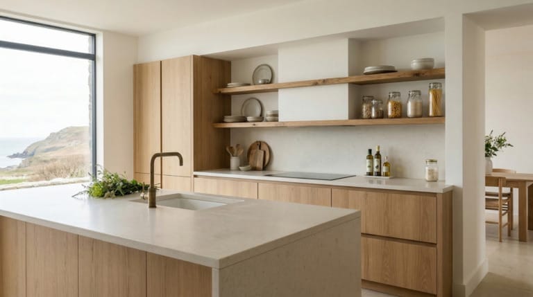
Open shelving for everything
Open shelving had a long run. The appeal is obvious — it makes a kitchen feel less closed-in, gives you somewhere to display things you actually like, and can work well when it’s done with restraint. The issue is that it became a default rather than a deliberate choice, and in most real kitchens it just means visible clutter.
If you want open shelving, think about exactly what will live on it and whether you’ll be happy looking at that every day. A couple of shelves in the right spot — next to a window, above a coffee station, or at the end of a run of cabinets — can feel intentional. Replacing half your wall units with open shelves across a whole kitchen wall rarely works as well in practice as it does in photographs.
The more lasting approach is to use closed storage as the backbone of the kitchen and introduce open display selectively. Your storage should work hard behind closed doors. What you put on show should genuinely earn its place.
Overly uniform handleless kitchens
Handleless cabinetry became popular for good reasons. It looks clean, it suits certain room shapes, and it can work well in a contemporary setting. But the way it’s often installed — push-to-open mechanisms across every single door and drawer, no variation anywhere — has started to feel rigid rather than refined.
The issue is usually uniformity rather than the style itself. A handleless kitchen where every surface is the same flat slab, with no change in texture, finish, or detail, can feel more like an office than a room you’d want to spend time in. It tends to photograph well but sometimes lacks warmth in person.
If you like a clean look, there are ways to get it without removing every tactile element. Recessed finger pulls rather than surface-mounted handles, a mix of handleless base units with more traditional upper cabinetry, or varying the door profile slightly across different zones can all add interest without compromising the overall feel.

Statement island with a contrasting colour that doesn’t connect to anything
Coloured islands became a go-to move for adding personality to an otherwise neutral kitchen. And they can work well. But the execution often misses something: the contrast is applied for visual interest without any real thought about how the island connects to the rest of the room.
An island in a deep navy or forest green in an otherwise pale kitchen can feel exciting in a showroom, but if the colour isn’t echoed anywhere else — in the joinery, the flooring, the lighting — it can feel like a piece of furniture that wandered in from a different project. The contrast draws attention without creating cohesion.
A better approach is to think about the island as part of a considered palette rather than a contrast statement. The colour shift can absolutely be there, but it should feel like it belongs. That might mean echoing the island tone in a run of open shelving, in the bar stool upholstery, or in the paint colour on a nearby wall.
Matching everything to within an inch of its life
The opposite extreme — where grout colour, cabinet colour, worktop veining, and floor tile are all trying to match exactly — can look just as awkward. Matchy-matchy kitchens were a reaction to the visual chaos of the 1990s, but taking it too far produces something that feels studied rather than designed.
Materials have natural variation. Stone worktops have movement. Timber floors have grain. Trying to suppress all of that in favour of a perfectly coordinated palette tends to flatten the room and remove the warmth that natural materials bring in the first place.
Instead, think about materials that are in the same family tonally but bring their own character. A warm grey slate floor doesn’t need to match the grey of your units exactly. The relationship between the two is what matters, not the match.
Downlights as the only lighting source
A grid of recessed downlights became the standard kitchen lighting specification for years. It’s a practical solution to an extent — you get even coverage across the ceiling — but it tends to produce flat, clinical light that makes a kitchen feel like a supermarket after dark.
Downlights have a place, particularly over worktops where you need good task lighting. But a kitchen also benefits from layers: pendant lights over an island or a table, under-cabinet LED strips for prep areas, and warmer ambient sources that can be dimmed in the evening. Getting this right is often one of the most cost-effective things you can do to change how a kitchen feels.
The position and colour temperature of your lighting matters too. Warm white sources (around 2700K to 3000K) suit most kitchens better than the cool, bluish light that cheaper downlights often produce. It’s worth thinking about the lighting plan early in the project, not as an afterthought once everything else is decided.

How Mastercraft approaches this
When we work with someone on a kitchen, we’re not trying to produce a version of whatever is popular on social media right now. We’re trying to design a kitchen that works properly for your home, your habits, and your taste — and that you’ll still find genuinely good to use in fifteen years. That means being honest when a choice that appeals to you is likely to feel dated quickly, and explaining why, rather than just agreeing with everything.
A lot of what dates a kitchen isn’t the individual choices in isolation — it’s the way they’re applied without enough thought about the whole. Colour, material, hardware, proportion, light: these things work together, and when one of them is out of step with the rest, you notice it even if you can’t immediately say why.
Every kitchen we design is drawn up specifically for the room and the person commissioning it. We don’t use template layouts or off-the-shelf configurations. That means the decisions we’re making with you are always grounded in the actual dimensions, light quality, and character of your home.
Explore more from Mastercraft Kitchens
If you’d like to see what a Mastercraft kitchen looks like in practice, or find out more about working with us in your area:
- Fitted kitchens in Liverpool
- Fitted kitchens in Manchester
- Fitted kitchens in Harrogate
- Fitted kitchens in Shrewsbury
- Fitted kitchens in Wirral
- Bespoke kitchens in Yorkshire
If you’re in the early stages of planning and want to talk through what you’re thinking, we’re always happy to arrange a design consultation. There’s no pressure — just a straightforward conversation about what you’re trying to achieve.
Frequently asked questions
How do I know if a kitchen design choice will date quickly?
Choices that rely heavily on a single trend for their appeal tend to age faster than those rooted in proportion, material quality, and practical function. It’s worth asking whether you’d still find the design appealing if it weren’t fashionable — if the honest answer is probably not, that’s a useful signal.
Is open shelving a bad idea in a kitchen?
Not at all, but it works best when it’s selective. A few shelves in the right position can add warmth and character. Replacing the majority of your wall storage with open shelving tends to create more visual clutter than most people want to live with day to day.
What’s a good alternative to a stark all-white kitchen?
Warm off-whites and linens tend to hold up better over time than cold, bright whites. Pairing a quieter base colour with natural stone, timber, or aged metal finishes gives the kitchen more depth and tends to feel more comfortable to spend time in.
How should I approach lighting in a new kitchen?
Plan it in layers from the start: task lighting over work surfaces, ambient lighting for general use, and something more atmospheric over a table or island. Warm white bulbs (around 2700K to 3000K) suit most kitchens, and putting circuits on dimmers gives you much more control over how the room feels at different times of day.
Does a contrasting coloured island work in a family kitchen?
It can, but the colour needs to connect to the rest of the room in some way rather than sitting in isolation. Think about whether the tone is echoed elsewhere — in hardware, upholstery, or nearby joinery — and whether the contrast feels like a considered decision or just a focal point for its own sake.

