
Colour is one of the most discussed decisions in any kitchen project, and one of the most misunderstood. A shade that looks considered in a magazine or on a paint card can feel flat, harsh, or simply wrong once it’s living in your actual room. Knowing why that happens makes it far easier to choose well.
Why kitchens are harder to colour than other rooms
Kitchens are complex spaces. You’re working with cabinetry, worktops, flooring, splashbacks, appliances, and often a mix of materials — all of which have their own undertones. A paint colour doesn’t exist in isolation. It reacts to everything around it.
Light is the other variable most people underestimate. A north-facing kitchen with one small window is a completely different environment from an open-plan rear extension with roof lights. The same paint colour can read as fresh and airy in one and cold and heavy in the other. Always assess colour in your own room, at different times of day, before committing.
Kitchens also have more visual competition than most rooms. There’s usually a lot going on: door fronts, hardware, worktop edges, appliance finishes. A colour that feels calm in a living room can feel chaotic in a kitchen if it clashes with too many of those fixed elements.
The problem with very bright whites
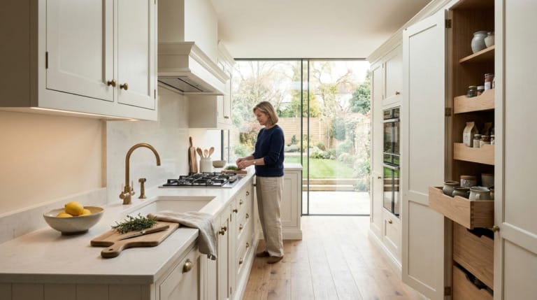
Pure brilliant white is the colour most people default to when they want a clean, fresh kitchen. The logic is understandable — it’s neutral, it’s safe, it goes with everything. In practice, it often does the opposite of what’s intended.
Brilliant white has a blue-cool undertone that can make a kitchen feel clinical rather than comfortable. In a space with artificial lighting or limited natural light, it can look flat and slightly grey. It also shows every mark and scuff more readily than slightly warmer whites.
The fix is usually a softer off-white — something with a hint of warm grey, stone, or cream in it. These shades still read as white in context but they feel alive rather than sterile. The difference between brilliant white and something like an aged linen or soft chalk can be significant in a kitchen setting, even if it seems subtle on a card.
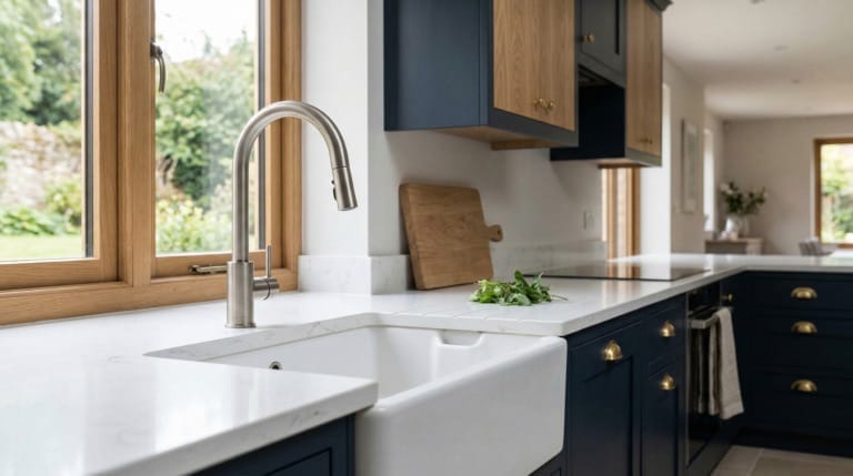
What goes wrong with very dark colours
Deep navy, forest green, charcoal, and near-black have all had a strong run in kitchen design, and rightly so — handled well, they give a kitchen real presence. But they’re easier to get wrong than many people expect.
The most common issue is scale. A dark colour that feels dramatic and considered in a large kitchen with good light can make a smaller or poorly lit room feel oppressive. Before choosing a dark shade for walls or cabinetry, it’s worth being honest about how much light your kitchen actually gets throughout the day.
Undertones matter too. Dark greens can shift towards khaki or grey depending on the light. Dark blues can read as almost black in the evening. What looks rich and saturated in a paint chart can behave very differently at 6pm in November. Testing a large sample on your actual wall, over several days, is not optional with dark colours — it’s essential.

The specific difficulty of grey
Grey has been the dominant kitchen colour for the better part of fifteen years, and for good reason. It’s versatile, it works with a wide range of materials, and it sits comfortably between warm and cool. The problem is that grey is an unusually complex colour family, and it behaves unpredictably.
Many greys have strong undertones — purple, blue, green, or pink — that only become visible once the paint is on the wall and reacting with the light and other surfaces in your room. A grey that looks clean and neutral in the tin can take on a distinctly lilac or seafoam quality in certain kitchens. This isn’t the paint company’s fault. It’s just the nature of grey as a colour.
If you’re drawn to grey, the safest approach is to pay attention to the undertones of everything else in the room first. Warm-toned cabinetry, wooden floors, and brass hardware tend to work better with warm greige-greys. Cooler materials like polished concrete, zinc, or chrome are more forgiving of cooler grey tones. Getting that alignment right takes a bit of attention, but it makes all the difference.
Warm terracotta, ochre, and orange tones
Warmer, earthier colours have come back into fashion, and in the right kitchen they can be genuinely lovely. But orange-adjacent shades are among the most difficult to use well, particularly on cabinetry.
The core problem is that warm terracotta and ochre tones are highly dependent on complementary light and materials. In natural daylight with warm timber flooring and linen upholstery, they can feel grounded and considered. Under cool artificial light with chrome appliances and a white ceiling, the same shade can look garish.
If you’re considering a warm earthy colour, think carefully about whether your room genuinely supports it. A south-facing kitchen with warm stone flooring is a very different proposition from a darker galley with overhead spotlights. When the conditions are right, it works. When they’re not, the result tends to look like a mistake rather than a design choice.
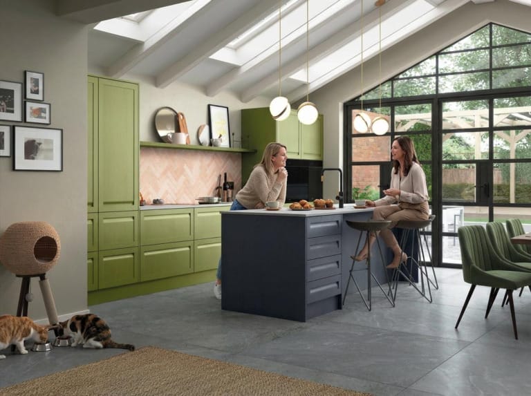
Overly saturated colours
There’s a version of almost any colour — teal, sage, blush, navy — that is so saturated it becomes difficult to live with long-term. Very intense colour in a kitchen is a specific challenge because kitchens are rooms you spend a lot of functional time in. Cooking, cleaning, eating breakfast, talking to your family. The colour is always there.
Designers who work with saturated colour in kitchens tend to use it on one element rather than across an entire space — a single run of cabinetry, an island, or a section of wall. That gives the colour room to be enjoyed without becoming exhausting. If you want a saturated shade throughout, it’s worth asking yourself honestly whether you’ve lived happily with bold colour before, or whether you’re making the decision based on a photo you liked.
The other consideration is resale. This is less important than making a kitchen you love, but it’s a real one. Highly personalised colour choices can limit your market if you sell in the next few years. That doesn’t mean avoiding them — plenty of bold kitchens sell well and attract buyers precisely because they’re distinctive. But it’s worth factoring into the decision.
 How Mastercraft approaches this
 How Mastercraft approaches this
When we’re working through a colour scheme with someone, the starting point is never the paint colour itself. We start with the fixed elements: flooring, any brickwork or stone that’s staying, the quality and direction of light, and the material specification for cabinetry and worktops. Colour only comes after that foundation is clear.
We also encourage people to hold off on finalising paint colours until later in the process than feels natural. It’s tempting to lock in the whole scheme early, but your eye for colour becomes much sharper once you’ve chosen your door fronts and worktops. Colours that seemed obvious at the start often get reconsidered once the bigger material decisions are made.
Every Mastercraft kitchen is designed for the room it’s going into, not from a template. That means the colour thinking is specific to your space, your light, and the other materials in play. We’d rather take the time to get that right than let anyone commit to something that’s going to feel wrong after six months of living with it.
Explore more from Mastercraft Kitchens
If you’re planning a kitchen project and want to see what’s possible in your area, you can find our work across the North of England and beyond:
- fitted kitchens in Liverpool
- fitted kitchens in Manchester
- fitted kitchens in Harrogate
- fitted kitchens in Leeds
- fitted kitchens in Wirral
- bespoke kitchens in Yorkshire
If you’re at the point where you’d like to talk through your kitchen in detail, we’d be glad to arrange a design consultation. It’s a good way to work through the decisions that matter most before anything gets committed to.
Frequently asked questions
How do I test a paint colour properly before committing to it in my kitchen?
Paint a large sample directly onto the wall — at least A3 size, ideally bigger. Look at it at different times of day, including in the evening under your artificial lighting. Don’t rely on small paint chips or digital swatches, as neither gives you an accurate read of how the colour will behave in your specific room.
Should I choose my paint colour before or after my kitchen cabinetry?
After, wherever possible. Your cabinetry, worktops, and flooring set the tonal foundation of the room, and paint colour should respond to those decisions rather than drive them. Choosing paint first often leads to having to compromise on one of the more expensive elements later.
Why does my grey paint look purple or green on the wall when it looked neutral in the tin?
Most greys have underlying colour tones that only become visible once they’re on the wall and reacting with your room’s light and surrounding materials. A grey with a blue undertone can shift towards purple under certain lighting, while one with a green undertone can look quite cold in a north-facing room. Testing large samples in your actual kitchen is the only reliable way to see how a grey will behave.
Can I use a very dark colour in a small kitchen?
Yes, but it requires more care. A dark colour in a small kitchen works best when the room has reasonable natural light and you’re using it deliberately rather than as a default. Pairing dark walls with lighter cabinetry, good task lighting, and reflective surfaces like glass or polished stone can help prevent the space from feeling closed in.
Is there a safe approach to colour if I’m planning to sell in the next few years?
Neutrals with a warm bias — off-whites, warm greys, and quiet greige tones — tend to appeal to the widest range of buyers and photograph well. If you want a stronger colour, consider using it on an island or a single wall rather than throughout the whole kitchen, which makes it easier for buyers to imagine adapting the space to their own taste.

