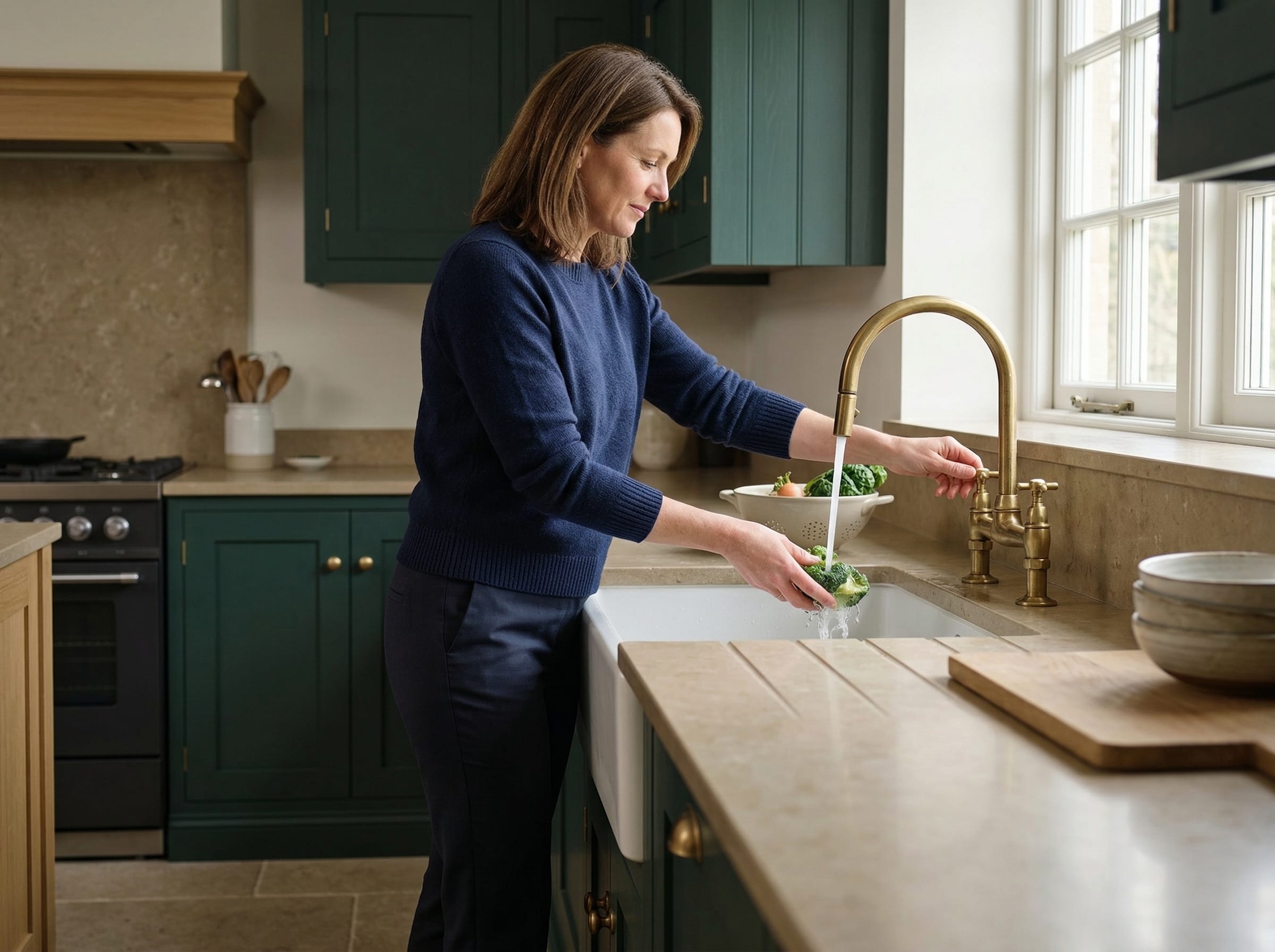
Colour is one of the decisions people tend to second-guess most when planning a kitchen. The instinct is often to play it safe, and that’s understandable when you’re committing to something that’s going to be in your home for fifteen years. But some of the most resolved kitchens we work on come from being willing to sit with a pairing that felt uncertain at first.
Why unexpected colour combinations often work better than the obvious ones
The issue with purely safe colour choices is that they can leave a kitchen feeling finished but not particularly felt. There’s nothing wrong with a white kitchen, but if the white is simply the absence of a decision rather than a considered one, that tends to show.
Unexpected pairings work when there’s a logic connecting them, even if that logic isn’t immediately obvious. Contrast in tone, a shared warmth or coolness, or materials that mediate between two colours — these are the things that hold a scheme together. When they’re right, people don’t necessarily identify the colours as surprising. They just feel that the room works.
It’s also worth understanding that context changes everything. The same two colours can read completely differently depending on your light, your floor, and how much of each colour is present.
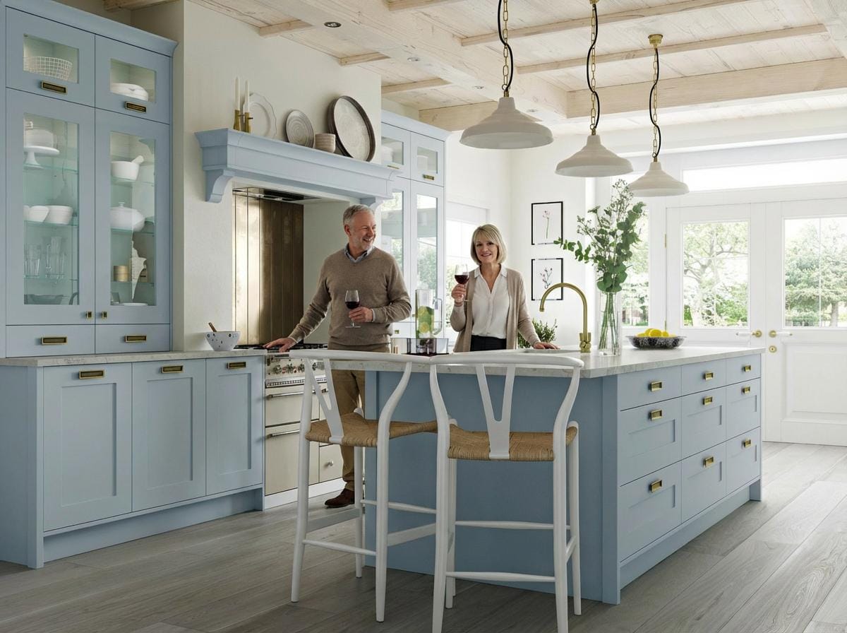
Inky blue and warm off-white
This is a pairing that sounds reasonable in theory, but people often baulk at the depth of the blue. They worry it will make the kitchen feel dark or heavy. In practice, it rarely does, provided the proportions are handled properly.
The key is usually to use the darker colour on the lower cabinetry and bring the off-white in above worktop height. That keeps visual weight low — which is how rooms tend to feel grounded rather than oppressive. The off-white does a lot of work here. A cool, clean white would pull the scheme apart. Something with a yellow or grey undertone bridges the gap.
Natural stone worktops with movement in them — a gentle veining, some variation in tone — help these two colours read as part of the same composition. Without something to tie them together at worktop level, blue and off-white can sit in the same room without quite belonging to each other.
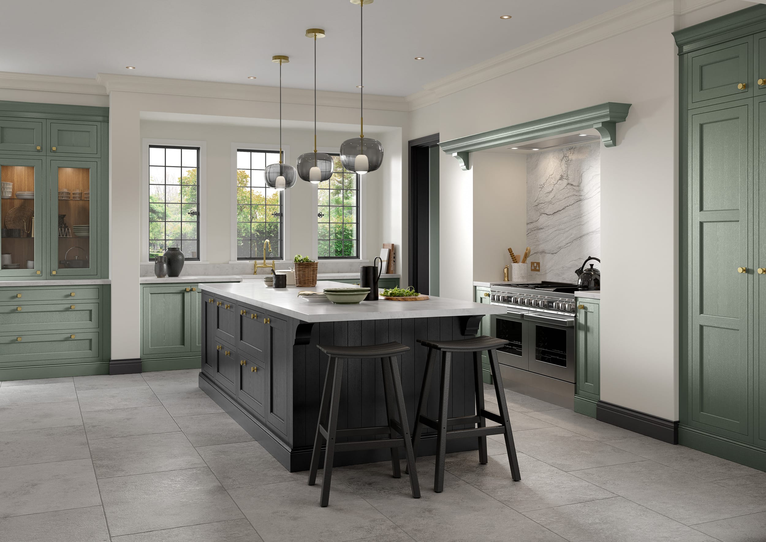
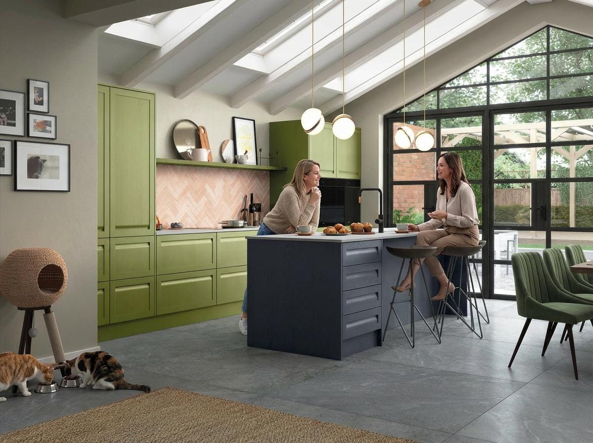
Sage green and dusty blush
This is the pairing most likely to raise eyebrows. Both colours are soft, and people worry they’ll fight with each other or produce something that feels too decorative for a working kitchen. That concern is valid if you let one of the tones tip too far in either direction.
Where it works is when both colours are genuinely muted. A sage that reads more grey than green, and a blush that reads more stone than pink. At that point they share a quality — a sort of chalky quietness — that connects them without either one demanding attention.
This combination works particularly well in kitchens with natural light that changes through the day. In morning light the sage comes forward. In the afternoon the blush warms up. The room shifts in a way that’s pleasant to live with.
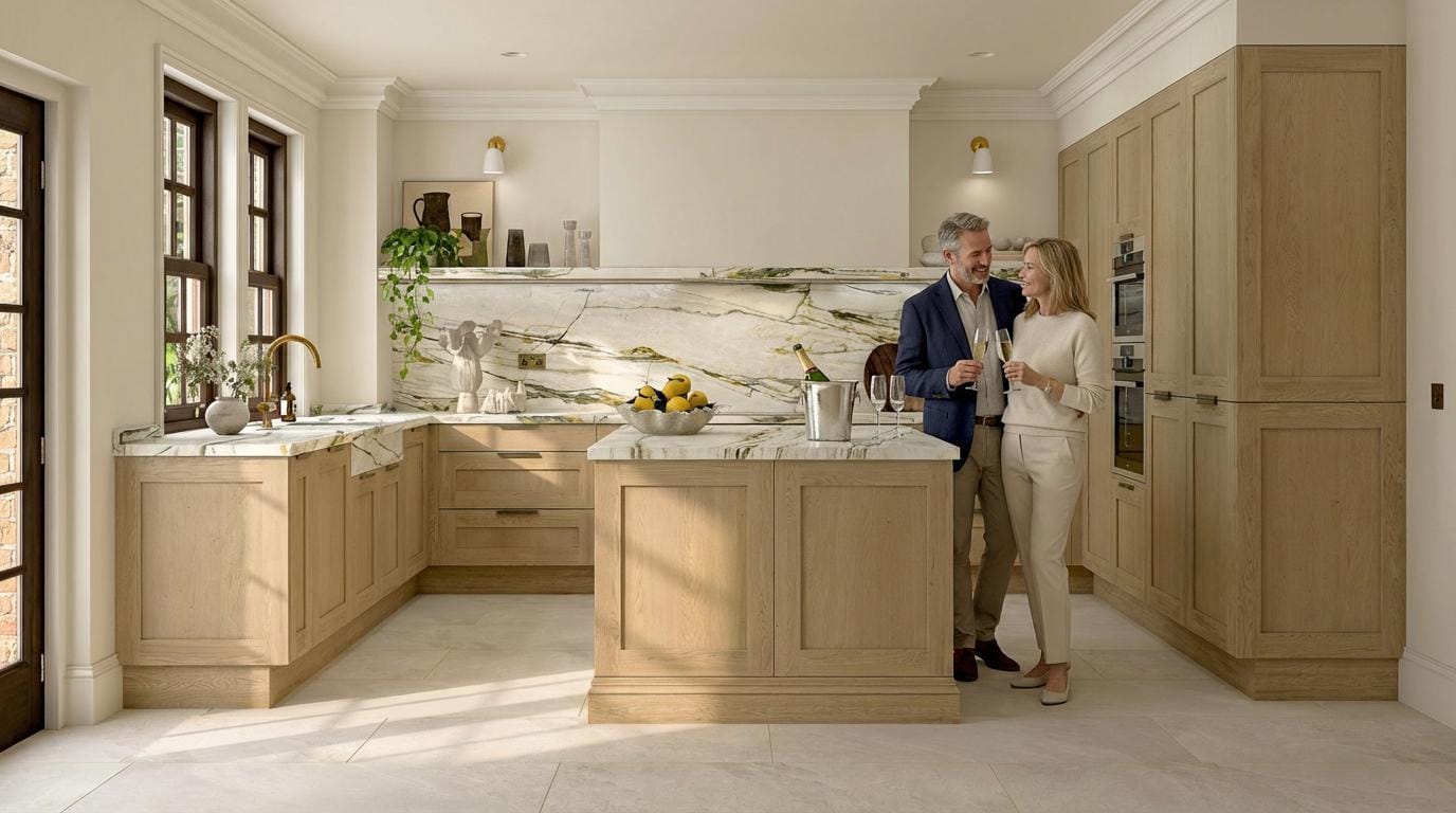
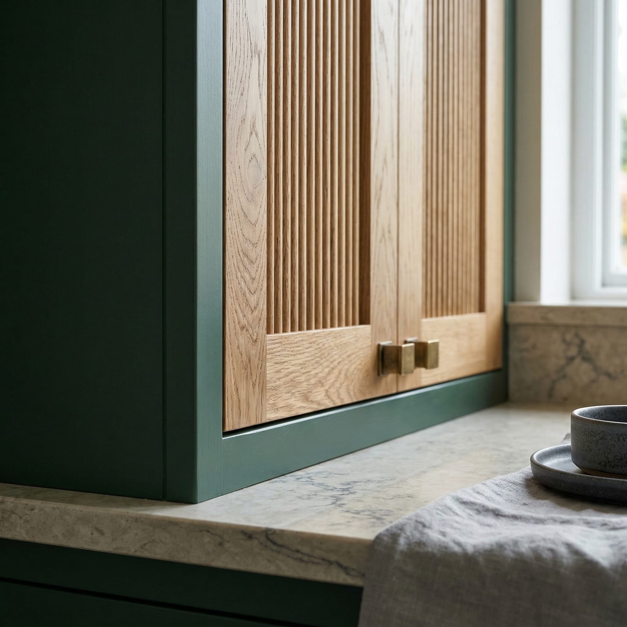
Charcoal and raw oak
This is less obviously unexpected than the others, but it’s a pairing that people hesitate over because the contrast feels severe on a mood board. A very dark painted finish sitting next to pale, natural-grained timber can look stark in isolation.
In a real kitchen, the severity tends to soften considerably. Oak has warmth in it that a paint swatch can’t communicate, and charcoal grounds the timber in a way that stops it feeling unfinished or rustic. The combination works because they balance each other’s weaknesses. The charcoal gives structure; the oak gives life.
The material between them matters enormously. A white quartz worktop can make this pairing feel clinical. A dark stone, or something with a brushed or leathered finish, brings the two elements together and gives the scheme the cohesion it needs.
The role of tone over colour
The reason these pairings work isn’t really about the specific colours. It’s about tonal compatibility. Two colours at similar levels of saturation and warmth will almost always be able to coexist, even if they’re far apart on the colour wheel. Two colours at very different levels of intensity will struggle, even if they’re considered complementary.
When you’re evaluating a pairing, try squinting at it. If the two colours read at a similar tonal weight when you remove the distraction of hue, that’s a good sign. It doesn’t guarantee the combination will work in your specific room, but it suggests the underlying relationship is sound.
This is also why looking at colours on a screen is unreliable. Monitors don’t show tone accurately, and they can’t tell you what daylight will do to a finish in your particular space.
Testing properly before you commit
Large samples, in the actual room, at different times of day. That’s the only reliable way to understand how a colour pairing will behave. A small paint chip or a door sample sitting on a worktop in a showroom is useful for initial direction, but it doesn’t tell you what you need to know.
If you’re working with a painted finish, get a sample pot and paint at least a square metre of board. Lean it against the cabinetry or wall and live with it for a few days. Look at it in the morning, in artificial light in the evening, and on an overcast day. Colours shift more than people expect.
For a two-colour scheme, consider the ratio as carefully as the colours themselves. A fifty-fifty split is rarely the most resolved approach. One colour usually needs to lead, with the other used more sparingly or at a different scale.
How Mastercraft approaches this
We don’t approach colour as a stylistic add-on decided late in the process. It’s part of the design brief from the beginning, alongside decisions about cabinetry style, materials, and how the kitchen connects to the rest of the house. The two influence each other, and treating them separately tends to produce results that feel slightly disconnected.
When a pairing feels unusual, we work through the reasoning with you. That might mean exploring why the tones relate to each other, how the specific materials in your kitchen will mediate between the colours, or what scale each colour should occupy in the room. The goal isn’t to talk you into something bold. It’s to help you make a considered decision rather than defaulting to something you’re not fully invested in.
Every kitchen we design is different, and colour is one of the things that makes a kitchen feel specific to the people who use it. Getting it right takes time and a clear understanding of your space. We’d rather spend that time properly at the start than leave you uncertain.
Start your Mastercraft design consultation
You'll work directly with a Mastercraft designer to plan a kitchen around your home, your layout and how you live day to day. From the first sketches through to technical planning and installation, everything is handled by one experienced in-house team.
Designed around your home
Every kitchen is made-to-measure for your room, your architecture and the way you use the space.
Technical survey included
We measure and plan everything before production begins so your kitchen fits exactly as intended.
Materials and samples
See door finishes, worktops and colours in your own home before making final decisions.
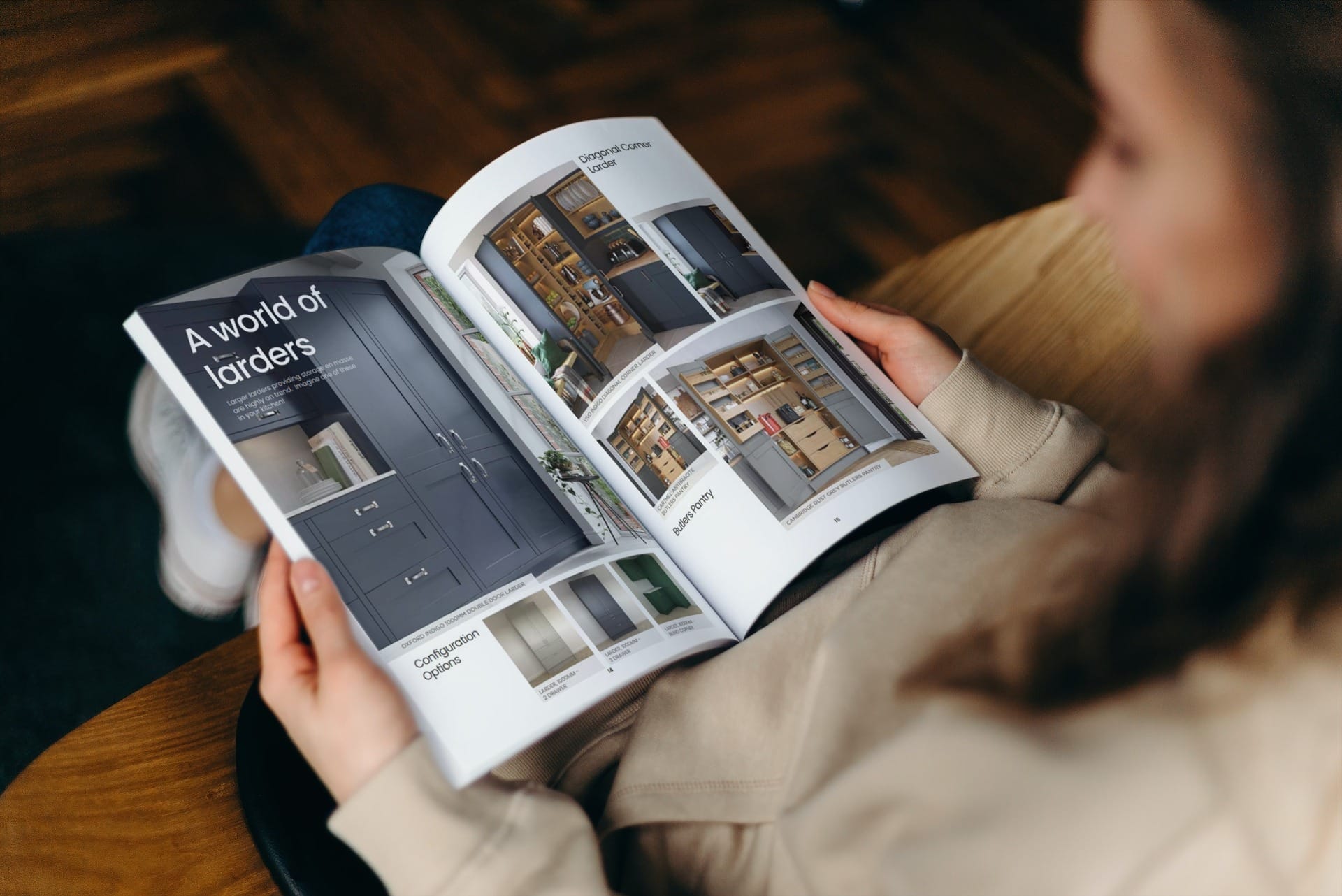
Browse the Mastercraft design library
Inside you'll find our brochures, design guides, material references and any current Mastercraft offers. A practical starting point if you're thinking about a kitchen but not ready to talk yet.
Explore more from Mastercraft Kitchens
If you’re planning a kitchen project and want to see what’s possible in your area, here are some useful starting points:
- fitted kitchens in Liverpool
- fitted kitchens in Manchester
- fitted kitchens in Harrogate
- fitted kitchens in Leeds
- fitted kitchens in Wirral
- bespoke kitchens in Yorkshire
If you’re working through colour decisions and would like to talk them through with one of our designers, we’re happy to arrange a consultation. It’s a useful conversation to have early, before other decisions start to narrow your options.
Frequently asked questions
How do I know if two colours will work together in my kitchen before I commit?
The most reliable method is large painted samples in the actual room, viewed at different times of day and in different light conditions. Tonal compatibility matters as much as the colours themselves, so look at whether both colours carry a similar visual weight when you’re assessing them together. A screen or a small chip is rarely enough to make a confident decision.
Will dark cabinetry make my kitchen feel smaller?
Not necessarily. Proportion and light play a bigger role than colour alone. Dark lower cabinets with lighter uppers, or dark cabinetry in a room with good natural light, can feel grounded and considered rather than heavy. The finish of the paint matters too — a flat or eggshell finish absorbs light differently to a satin, which affects how the colour reads.
Is a two-colour kitchen scheme harder to design than a single-colour one?
It requires more thought, but it’s not inherently more difficult. The main things to establish are the ratio of each colour and what connects them — usually the worktop material or hardware finish. A two-colour scheme that’s been properly considered often feels more resolved than one that relies on a single colour throughout.
What worktop materials work best with bold or unusual colour combinations?
Natural stone with some movement — a gentle vein or tonal variation — tends to bridge colour combinations more successfully than very plain or uniform surfaces. Honed finishes can also help, as they reduce reflectivity and allow the colours around them to settle. Very stark white quartz can work against an unusual pairing by adding too much contrast.
How does natural light affect my kitchen colour choices?
Quite significantly. North-facing rooms will make cooler colours feel cooler still, and can make some greens and blues read quite differently to how they look in a south-facing showroom. Warm undertones in a paint colour can help compensate for limited natural light. If your kitchen changes character through the day, it’s worth checking your chosen colours in morning light, afternoon light, and under your artificial lighting scheme.